ITP blog · critical-objects
Assignment 1 - Cyclic Packaging
Our first assignment was simply to build a critical object. My partner (Shu-Ju Lin) and I brainstormed a bunch of topics to critique, briefly listed here:
- capitalism / wealth redistribution / the fact that billionaires exist and that's a normal thing
- Spotify as a gatekeeper for music discovery and its business model which doesn't sufficiently support small artists
- paying for "free" web services with your personal information (I did a project related to this a while back: you are the product)
- smartphones are the new cigarettes (partly inspired by this recent GQ article)
- excess plastic and trash created through packaging goods, shipping them long distances (article 1, article 2)
- the current supreme court gun control case in NY (article)
- food waste created in American households
We came up with interesting concepts for a few of these topics, but ultimately decided to create a low-tech (read: not electronic) object critiquing packaging and the online shopping experience. Yes, we realized that paper and plastic trash created this way is not the biggest contributor to carbon emissions or pollution, but at least for this initial assignment, we think it's ok to engage in discussion about a small(er) problem.
Packaging & the online shopping cycle
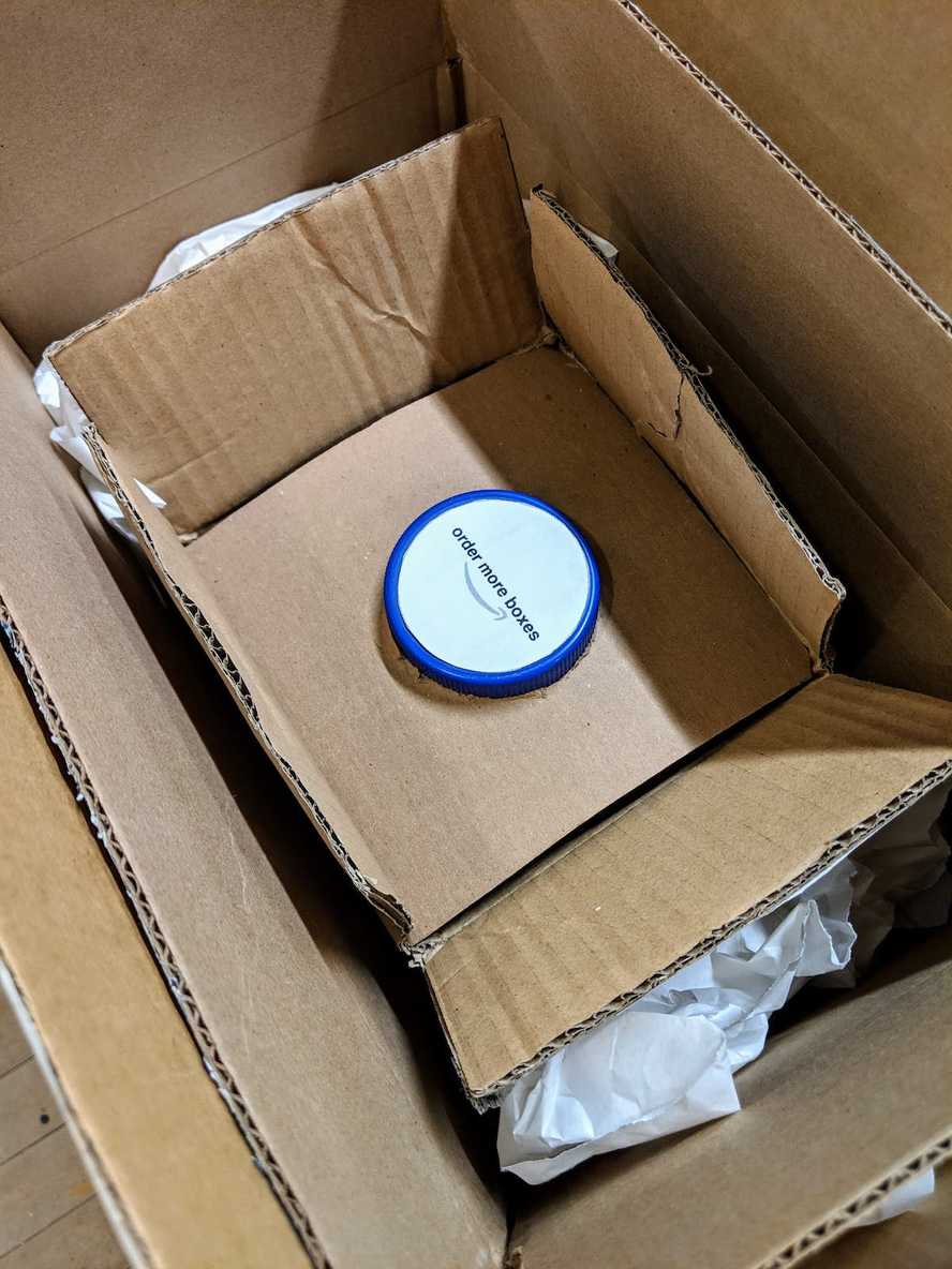
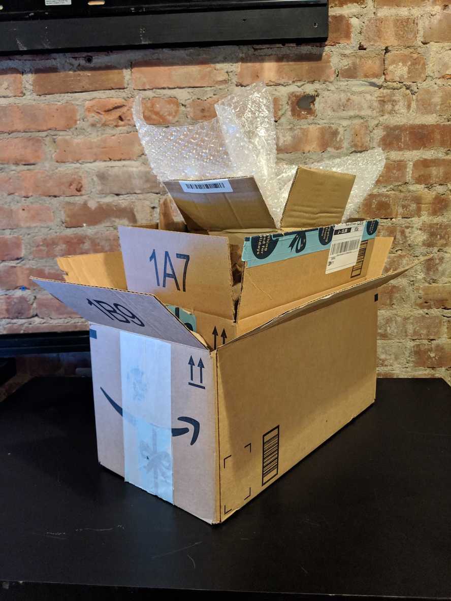
Many of us have had the experience of receiving a package from Amazon or a similar online retailer where the packaging material significantly exceeds the volume of actual product we ordered. Plastic inside boxes inside boxes inside boxes, etc. It can feel like a Matryoshka doll toy. We created an object which highlights this situation and makes the viewer / user consider the endless cycle of packaging which is a byproduct of the shopping experience. There are three boxes and when you open the innermost one, you see a button labeled "order more boxes". Here, we took inspiration from Amazon Dash buttons which are designed to bring the "one-click" shopping experience to the physical world.
Order a package, get a one-click button, repeat.
As far as the functionality of this object, we felt that it can convey its message without a fully functional prototype, since the time scale of the real interaction would be too long to appreciate in most contexts anyway. Yes, we could hook up the button to a microcontroller or Pi and have that order a new box on Amazon with one push, but that would only add marginal meaning to the experience since the user would have to wait a few days for the package to arrive. There may be ways to work around this problem and make the object more functional in other ways; perhaps we'll consider those for future projects.

